Faced with a new book, an illustrator ponders. Should the illustrations decorate the page or interpret the text? Should they interpret it scene by scene or accompany it at a distance as a visual counterpoint? Will they be simple visualizations, getting the costumes, settings and characters as ‘anyone’ would wish to see them, or a more personal interpretation? Will they be chapter headings, full pages or vignettes? How many have been commissioned, how frequently will they occur? Will their even placing coincide with illustratable moments, or will favourite scenes have to be ditched and minor ones brought forward?
When I am reading a book for illustration, it bristles with Post-It notes marking possible opportunities. And, whichever option I choose, there is an overall stylistic decision to be made: some illustrators bring their own, instantly recognizable style to every book they do; others try to find a new manner appropriate to the job in hand.
The Christmas books produced in recent years by my friends in the Society of Wood Engravers offer a mini-survey of such options. They have provided the artists with the chance to illustrate grown-up literature – something usually confined to publishers like the Folio Society (not that there is anyone quite like the Folio Society) or the private presses. And they are beautiful in themselves. The format is a classic one in the fine-print world: a 10 x 7-inch, single-section booklet bound in card covers with wrappers of Ingres paper, each in a different colour. On the one hand, these build up into a little rainbow of hues that reflects the books’ diversity. On the other, the quality of the papers and the printing makes the books a treat for hand as well as eye, a tactile pleasure as well as a delight to read. They are printed letterpress in editions of 500 each.
Perhaps I should first explain what ‘letterpress’ and ‘fine-print’ mean. Commercial printing today – all normal printing – is by off
Subscribe or sign in to read the full article
The full version of this article is only available to subscribers to Slightly Foxed: The Real Reader’s Quarterly. To continue reading, please sign in or take out a subscription to the quarterly magazine for yourself or as a gift for a fellow booklover. Both gift givers and gift recipients receive access to the full online archive of articles along with many other benefits, such as preferential prices for all books and goods in our online shop and offers from a number of like-minded organizations. Find out more on our subscriptions page.
Subscribe now or Sign inFaced with a new book, an illustrator ponders. Should the illustrations decorate the page or interpret the text? Should they interpret it scene by scene or accompany it at a distance as a visual counterpoint? Will they be simple visualizations, getting the costumes, settings and characters as ‘anyone’ would wish to see them, or a more personal interpretation? Will they be chapter headings, full pages or vignettes? How many have been commissioned, how frequently will they occur? Will their even placing coincide with illustratable moments, or will favourite scenes have to be ditched and minor ones brought forward?
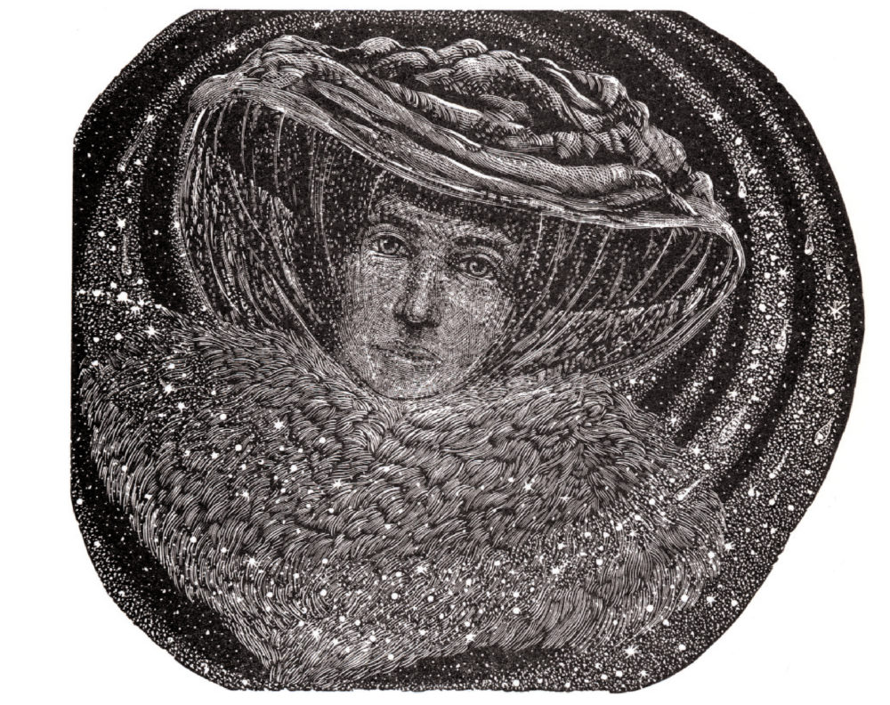
When I am reading a book for illustration, it bristles with Post-It notes marking possible opportunities. And, whichever option I choose, there is an overall stylistic decision to be made: some illustrators bring their own, instantly recognizable style to every book they do; others try to find a new manner appropriate to the job in hand. The Christmas books produced in recent years by my friends in the Society of Wood Engravers offer a mini-survey of such options. They have provided the artists with the chance to illustrate grown-up literature – something usually confined to publishers like the Folio Society (not that there is anyone quite like the Folio Society) or the private presses. And they are beautiful in themselves. The format is a classic one in the fine-print world: a 10 x 7-inch, single-section booklet bound in card covers with wrappers of Ingres paper, each in a different colour. On the one hand, these build up into a little rainbow of hues that reflects the books’ diversity. On the other, the quality of the papers and the printing makes the books a treat for hand as well as eye, a tactile pleasure as well as a delight to read. They are printed letterpress in editions of 500 each. Perhaps I should first explain what ‘letterpress’ and ‘fine-print’ mean. Commercial printing today – all normal printing – is by offset-litho: the difference between the print and the page is made on a flat surface by the separation of oil and water (lithography), but put on to the paper at two removes when the text is ‘offset’ on to another cylindrical surface and only from there to the paper. The text is set by computer, then photographed for transfer to the printing plate. Images are scanned in by computer too, then converted to printable form, usually the dots-per-square-inch we have long been familiar with in newspapers, and similarly photographed on to the plate. What appears on the page, brilliant as it may be, is thus at some distance from the drawing the artist made, or the photograph a photographer took, or the design produced for printing as a wood engraving by the artist working with engraving tools on wood. Not so with letterpress. For Brian Bailey, letterpress printer at Libanus Press in Marlborough, where most of the SWE books are printed, each letter is a separate piece of type, locked into line with its neighbours to make words and paragraphs, as it has been since the days of Gutenberg. The type impresses itself fractionally into the paper so each letter has a minuscule three-dimensional quality, which is why letterpress is sparklingly more legible than offset. Ink-flow and pressure are minutely adjusted as Brian gentles the great Heidelberg press into action. It picks up the paper with a little hiss of compressed air, passes it round the circuit of rollers into contact with the type, locked into place at the bed of the press, and drops it behind the shiny chrome protection grille, this time with a little puff of dust to stop it offsetting on to the next sheet. If need be, every sheet can be monitored. By contrast, commercial presses can print an entire book, both sides of the page at once, on one vast sheet of paper: phenomenal but elephantine by comparison. In letterpress printing, the illustrations may be printed direct from the woodblock engraved by the artist. They are originals. To watch Brian doing this is a revelation. I especially remember his printing Judy Jaidinger’s engravings for E. Nesbit’s The Three Mothers. One image of a veiled woman was all net and nose. Then, by laying down carefully pared pieces of onion-skin tissue-paper behind the place where the impression would be made, Brian brought out and made visible the expression of traumatized, envious sympathy the artist had engraved into the wood in her depiction of the woman’s face. It slowly came alive at his touch – though Brian would pass the credit back to the artist who created the picture. I suppose he is right; but his contribution is closer to that of a concert pianist interpreting a score than that of an engineer. The engraver here, Judith Jaidinger, is an American printmaker whose work has dealt much with the predicament of women from the nineteenth century on. She seemed an ideal choice for The Three Mothers. She made four illustrations, one of which is presented as a frontispiece; the others are set within the text. They are straightforward visualizations of a social realist tale, though with a touch of the mystic underlying them. The Three Mothers was first published in the Strand Magazine in 1908 and in book form in 1909. It is a tear-jerker such as only Nesbit can write, the story of a baby lost and a baby found, though with a sharp social irony too. In the afterword, which all the books carry, Nesbit’s biographer Julia Briggs puts it in context. The covers, rather emotionally, are dusty rose and pale violet. This is the one British piece in the series so far. In a second story, Hans Christian Andersen’s The Most Incredible Thing, people try to do just that to win the hand of a princess. In her interpretation, Jane Lydbury does not illustrate the feats described in this, one of Andersen’s lesser-known tales, but adds her own, extending and updating the text with sword-swallowers and tango-dancers in a stagey, modernist setting. In her afterword, Andersen biographer Jackie Wullschlager similarly draws out the story’s political parallels, then and now. There is a toughness at the heart of this fairytale which the covers, bronze over iron-grey, have been chosen to reflect. Here, the two main illustrations have a page to themselves. By contrast, my own four engravings for The Flight into Egypt were designed to fit within the block of text at the points they illustrate, but horizontally and therefore perhaps more decoratively or formally. First published in 1899, this tale by Selma Lagerlöf, 1909 Nobel Prize winner (she wrote The Tale of Gösta Berling), is a sort of desert version of the cherry-tree carol. The ‘Bow down, tall cherry-tree and give my Mother some’ of the northern carol may indeed have originated in this older version, found in the Apocrypha and lovingly retold by Lagerlöf in her Christ Legends. The presentation hints at the deep blue and gold of the desert sky and sand. Andersen . . . Lagerlöf . . . One idea behind the series has been to publish European writers and match them with British illustrators (the Nesbit and Jaidinger book is the exception, a British writer with an American illustrator) but this involves risks. The names of Timmermans and Longo are not well known to British readers. In Zeno Burg (1997) by the Italian Giuseppe Longo (born 1941) is the monologue of a hypochondriac tenor trying to get to sleep in an icy castle on Christmas night. It is manic, funny (risingly so), sweet and fantastical. There is only one fullstop in it. Our resident hypochondriac illustrator Peter Forster therefore opted for a single Michelangelesque frontispiece of the protagonist – the aforesaid tenor – in striped pyjamas and crumpled sheets. There is a little tailpiece too and on a binding of icy blue but with warmth within because he gets to sleep snugly enough in the end.) John Lawrence’s engravings for Saint Nicholas in Distress take another approach. Printed in a second colour at the Rampant Lions Press in Cambridge, they follow the story of a resourceful little girl who is forgotten by Saint Nicholas but gets her way in the end. They are framed and set about with perky characters and toys, which are more to do with fun than with narrative drive. But the story bowls along anyway, the only one in the series that might also be called a children’s tale. It is by the classic Belgian writer Felix Timmermans (1886-1947), who recreated the world of Flemish folklore with a Bruegelesque touch. Lastly not many British readers will have heard of Maria Dabrowska (1889-1965) either, a writer whose Nights and Days is considered the most important work of Polish realism of the twentieth century and whose diaries are celebrated. Christmas, written in 1919 and first published in 1923, appears in this translation as A Polish Christmas (bound of course in Polish red). A country-house Christmas in the 1890s is brought to life for us – touching, different and pungent. Christ Daunt’s engravings are vivid in their bold handling and in their design. The translation is by his wife, Dorota Debska-Daunt, and the end-note by Jerzy Szumski, Dabrowska’s literary executor. The Society of Wood Engravers publishes one of these little books most years – though not this year as the Society’s resources have been taken up with ensuring the continued supply of the end-grain woodblocks on which the art depends; preparing these mirror-smooth pieces of box or lemonwood is an art in itself. We like to think the books make ideal presents, and they are idealistic publications in several ways: in their choice of writers not well known to British readers, in their promotion of wood-engraving, in their illustration of grown-up texts, and in their commitment to the book as a beautiful thing in itself. It would be wrong to suggest that fine-print publishing is ‘better’ than the mainstream. It is different; it has its place. It treats the making of books almost as a piece of individual hand-craftsmanship, akin to the making of their contents: the crafting of words, the engraving of feeling images into fine-grained wood, a work of the hand and mind together.Extract from Slightly Foxed Issue 4 © Simon Brett 2004
About the contributor
Simon Brett is a wood engraver. He’s not a comedy and mystery writer. That’s the other one.
