
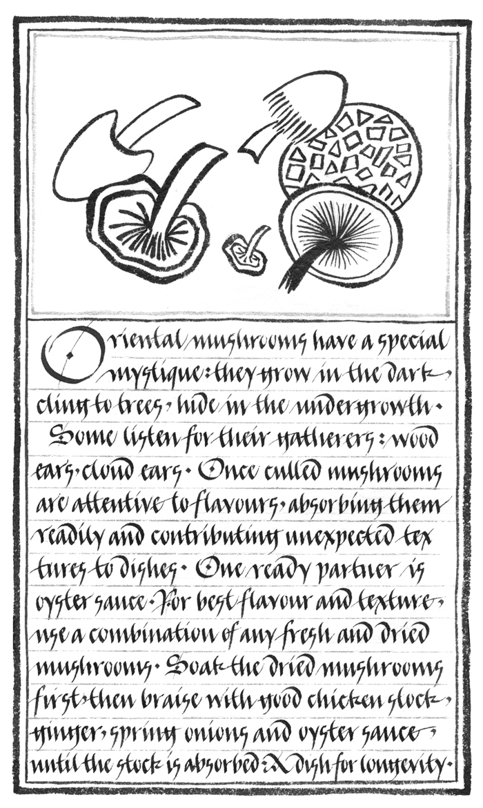
In Issue 1, I described the tradition in Chinese books of placing an illustration above a solid block of text on each page, a tradition that I set out to revive in my Chinese cookery manual. In the image above the script is written with a quill. I used a modernized version of the Bastard Gothic hand known as bâtarde or bastarda, which incidentally provided the basis for a number of early typefaces in France and England. It has a cursive quality akin to Chinese calligraphy and is roughly contemporaneous with the golden age of Chinese printed books in the mid to late Ming dynasty. The text runs horizontally and each line is separated by a thin gold rule.
The homogeneity of the Chinese page relies for the most part
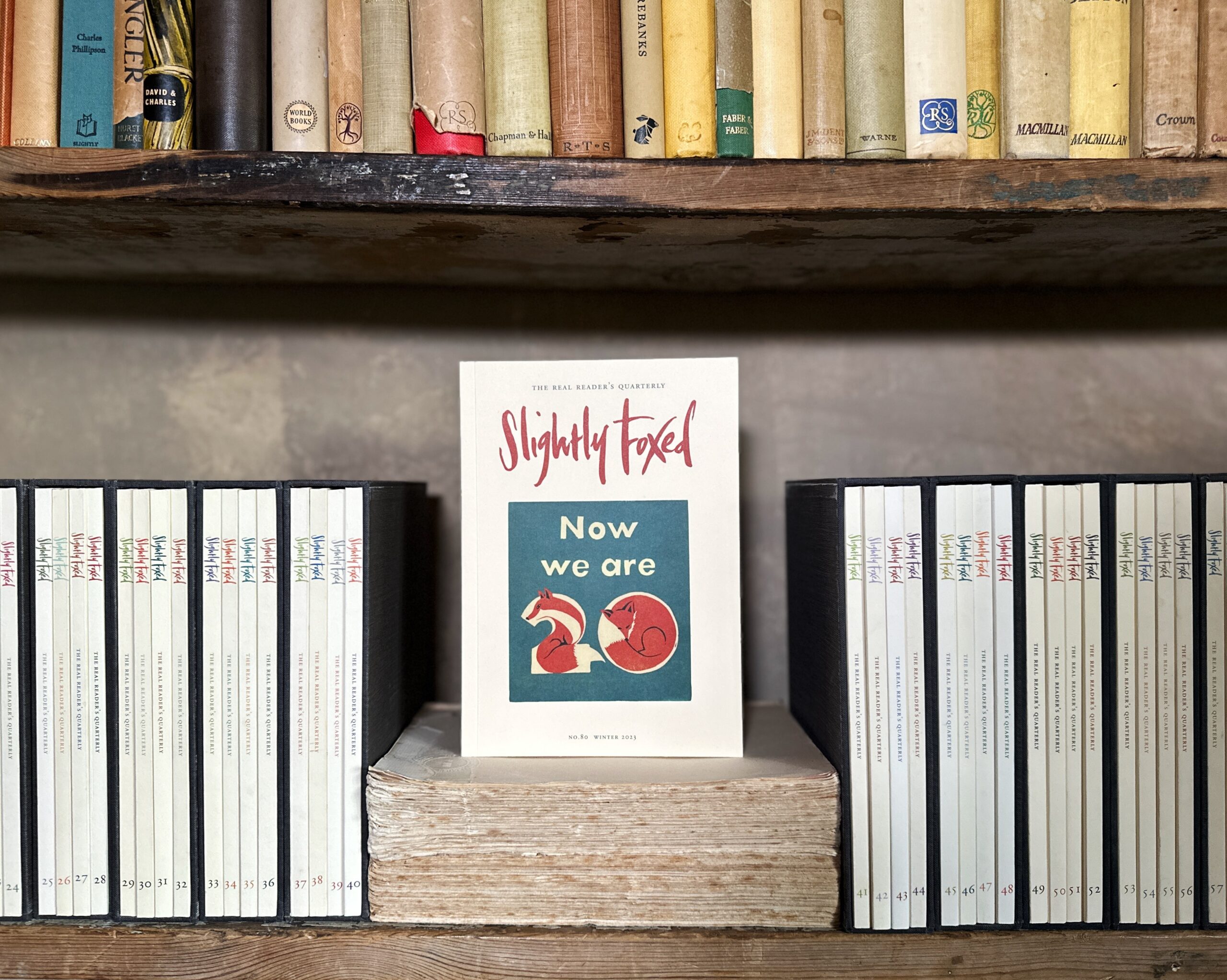
Subscribe or sign in to read the full article
The full version of this article is only available to subscribers to Slightly Foxed: The Real Reader’s Quarterly. To continue reading, please sign in or take out a subscription to the quarterly magazine for yourself or as a gift for a fellow booklover. Both gift givers and gift recipients receive access to the full online archive of articles along with many other benefits, such as preferential prices for all books and goods in our online shop and offers from a number of like-minded organizations. Find out more on our subscriptions page.
Subscribe now or Sign inIn Issue 1, I described the tradition in Chinese books of placing an illustration above a solid block of text on each page, a tradition that I set out to revive in my Chinese cookery manual. In the image above the script is written with a quill. I used a modernized version of the Bastard Gothic hand known as bâtarde or bastarda, which incidentally provided the basis for a number of early typefaces in France and England. It has a cursive quality akin to Chinese calligraphy and is roughly contemporaneous with the golden age of Chinese printed books in the mid to late Ming dynasty. The text runs horizontally and each line is separated by a thin gold rule.
The homogeneity of the Chinese page relies for the most part on the fact that both text and illustration are made with the same instrument: the brush. In this book the illustrations were executed with a Chinese brush, which has the flexibility to create lines of varying width depending on pressure, in much the same way as a broad-edged quill naturally creates thick and thin strokes. In an attempt to relate the line illustrations to the text, the initial dropped capital on each page reflects the lines or movement of the illustration above.Extract from Slightly Foxed Issue 3 © Susan Leiper 2004